What happened to Blake’s signature logo?
Students respond to Blake’s new wordmark
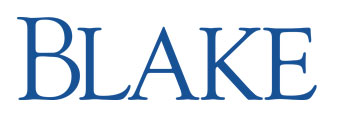
Blake’s new wordmark
For years the Blake wordmark with ‘The Blake School 1900’ in blue font with a green circle partially encompassing the letters has been one of the iconic symbols of The Blake School. However, this iconic symbol, adopted 15 years ago, has recently been changed to the letters ‘BLAKE’ in blue as part of a new brand identity system at Blake.
Kristin Stouffer, Director of Strategic Communications at Blake, spearheaded this project and explains that it has been changed in response to a survey conducted with Blake alumni and faculty. She describes this as the brand identity system, which is a collection of visual tools used to represent an organization, including style guidelines to ensure that the tools are used consistently such as logos, wordmarks, color palettes and fonts.
These findings from the survey led Blake to slightly alter its current brand identity system, including updating Blake’s wordmark, the wordmark for the Summer at Blake program, and the wordmark for Blake’s Annual Fund. However, this update did not include an update to Blake’s athletic brand identity.
To create this update, Blake partnered with Neustadt Creative Marking, a company that creates brand identities specifically for academic institutions. Stouffer explains that, “The new Blake wordmark was designed to reflect a sense of tradition, confidence and preeminence,” at Blake.
Likewise, she explains how this update has begun to be implemented over the summer. Because Blake wants “to keep this process manageable and cost efficient, there is no firm deadline on when the old Blake logo and accompanying materials will be phased out.” Stouffer concludes that despite this slight complication, the logos on Blake buildings and fields will be updated as needed.
The new Blake watermark has received mixed feelings from the Blake student community. Norah Mortensen ‘16 explains how she “likes the new watermark because it’s plain and simple”. However, while Mortensen sees the simplicity of the watermark as a positive quality, Geordie Roscoe ‘16 explains how the new wordmark “seems like [it is in] a standard word font that looks unprofessional.” Likewise, Merrick Pearson Smela ‘15 describes that he likes the new wordmark because it “looks better, [the new wordmark] looks like little effort went into it.” Similarly, Zeam Porter ‘16 explains how the old watermark “looks more welcoming with the green circle around it.”

Deniz has been an "editor" since the beginning of his junior year and declares himself the "bananagram king." He enjoys the color brown and long walks...